CSS sprites aren’t anything new. They have been around for years, and are one of the methods to optimise website’s load time. The idea is to incorporate multiple images into one and in this way decrease number of round trips between the server and the browser.
In its traditional use, CSS sprites work as a replacement for images and cannot be used as a background. Alas that is exactly what I wanted to do with a quote and flag icons like the following:
Update: This website has evolved slightly since 2013. The flags are no longer used (replaced by content negotiation) and quote sprite icon has been replaced by an SVG. While I no longer use this technique, it is of course still valid.
After some playing around I’ve finally figured out how to get this working. Even though there are some caveats, sprites can be used as a top-left no-repeat background image as well.
Basics
Let’s start with the basics. Sprites incorporate many images into a bigger one and use CSS to display only what is needed. Take the below image with a roll-over effect for example:
HTML5
A naïve approach would require ten separate images for this effect. Sprites in tandem with CSS allows this number to go dawn to one. HTML code is simple and unimpressive:
<div id="html5"><span
id="spriteh">H</span><span
id="spritet">T</span><span
id="spritem">M</span><span
id="spritel">L</span><span
id="sprite5">5</span></div>
In the absence of styles it simply spells ‘HTML5’ so if stylesheet fails to load, user can still sees the message. To make a picture out of those spans their dimension must be set, text content hidden and background image added. The following is would be a good start:
#html5 { width: 500px; }
#html5, #html5 span { height: 100px; }

#html5 span {
  display: inline-block;
  text-indent: 100%;
  overflow: hidden;
  background-image: url('html5-sprite.jpg');
}

#spriteh { width:  74px; }
#spritet { width:  52px; }
#spritem { width:  90px; }
#spritel { width:  96px; }
#sprite5 { width: 188px; }
So far it’s nothing more than regular ‘replace text with a picture’ CSS trick. Because of that, each span would display the image starting with its top-left corner, end result being a rather repetitive image of the letter ‘H’. The missing ingredient is background-position CSS property which instructs the browser to start drawing the background from a different offset. With a bit more styling, the code is almost complete:
#spritet { background-position:  -74px 0; }
#spritem { background-position: -126px 0; }
#spritel { background-position: -216px 0; }
#sprite5 { background-position: -312px 0; }
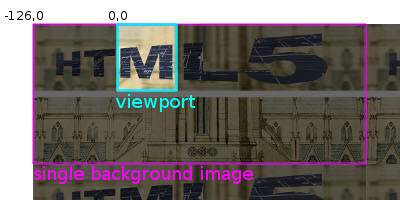
By default, background image spans an infinite plane repeating indefinitely in all directions. Picture’s top-left corner is aligned with element’s top-left corner producing the backdrop for its contents.
background-position property specifies the origin point of the background image in element’s coordinate system. In other words, it instructs the browser to shift the image by given amounts and than cut whatever overlaps with the element for the background. By setting position to -126px, the 127th pixel of the background image will be aligned with top-left corner of the element.
With that knowledge, getting roll-over effect is now trivial:
#spriteh:hover { background-position:    0   -110px; }
#spritet:hover { background-position:  -74px -110px; }
#spritem:hover { background-position: -126px -110px; }
#spritel:hover { background-position: -216px -110px; }
#sprite5:hover { background-position: -312px -110px; }
Note that the big image has a ten-pixel gap between sprites. It prevents pixels from adjacent sprites ‘bleeding’ over to the other images.
A bit simpler method
The above is the normal method of using sprites. In the presented example, there’s an easier way. Instead of setting background image for each individual span element, it’s simpler to set background for the wrapping div element and cover it with span’s only when they are hovered. CSS code for that looks as follows:
#html5, #html5 span { height: 100px; }
#html5 {
  width: 500px;
  background-image: url('html5-sprite.jpg');
}
#html5 span {
  display: inline-block;
  text-indent: 100%;
  overflow: hidden;
}
#spriteh {
  width: 74px;
  background-position: 0 -110px;
}
#spritet {
  width: 52px;
  background-position: -74px -110px;
}
#spritem {
  width: 90px;
  background-position: -126px -110px;
}
#spritel {
  width: 96px;
  background-position: -216px -110px;
}
#sprite5 {
  width: 188px;
  background-position: -312px -110px;
}
#html5 span:hover {
  background-image: url('html5-sprite.jpg');
}
Using sprites for background
Finally, we arrive at using sprites as background. The trick here is the no-repeat value which causes the background image to be painted only once, for example:
blockquote {
  background: url('…') no-repeat;
  padding: 0 26px;
  min-height: 20px;
}
In regular sprites, the interesting part of the image is cropped thanks to the limited size of the element. Trying to use an image with multiple sprites as a background would result in whatever is on the right or bottom of the icon to be shown as well.
However, if there’s nothing on the right or below the icon, if it is the last thing in the sprites image, the above is no longer an issue. And with no-repeat value, we instruct the browser not to wrap around the image thus sprites on the left or top of the image aren’t shown either.
It becomes apparent that using a staircase-like image with nothing but transparent background below the diagonal, sprites on the diagonal can be used as a top-left no-repeat background icon.
With that knowledge, the following styles can be constructed:
blockquote, .plFlag, .enFlag {
  background: url('/d/s.png') no-repeat;
}
blockquote {
  background-position: -100px 0;
  min-height: 20px;
}
.plFlag {
  background-position: -50px -50px;
  text-indent: 22px;
}
.enFlag {
  background-position: -75px -25px;
  text-indent: 22px;
}
This technique can be extended in certain situations — either when the height or width of the element is specified. In those situations, more icons can be present either on the right or below the sprite used as a background.
Certainly limited, but if there are only a few cases when this method needs to be used, it allows more images to be converted into sprites than previously expected. And it’s what enabled me to convert all but one small images on this site to CSS sprites.